
Case Study
Covers Review Page Redesign
A research-driven redesign for review pages clicking out well below Covers’ best commercial pages, leading with less so the clickout gets the room it needs.
UI DesignUX ResearchDesign SystemResponsive Design
The toplist is the shared component on nearly every Covers commercial page. I redesigned it to help Users quickly scan and compare sportsbooks, a pattern others in the Legend sports pillar went on to adopt.
Section 01
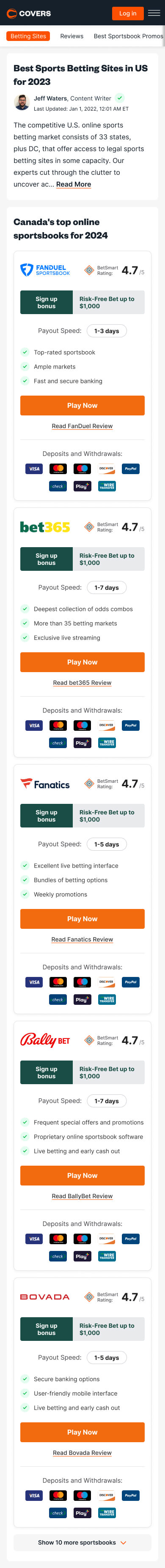
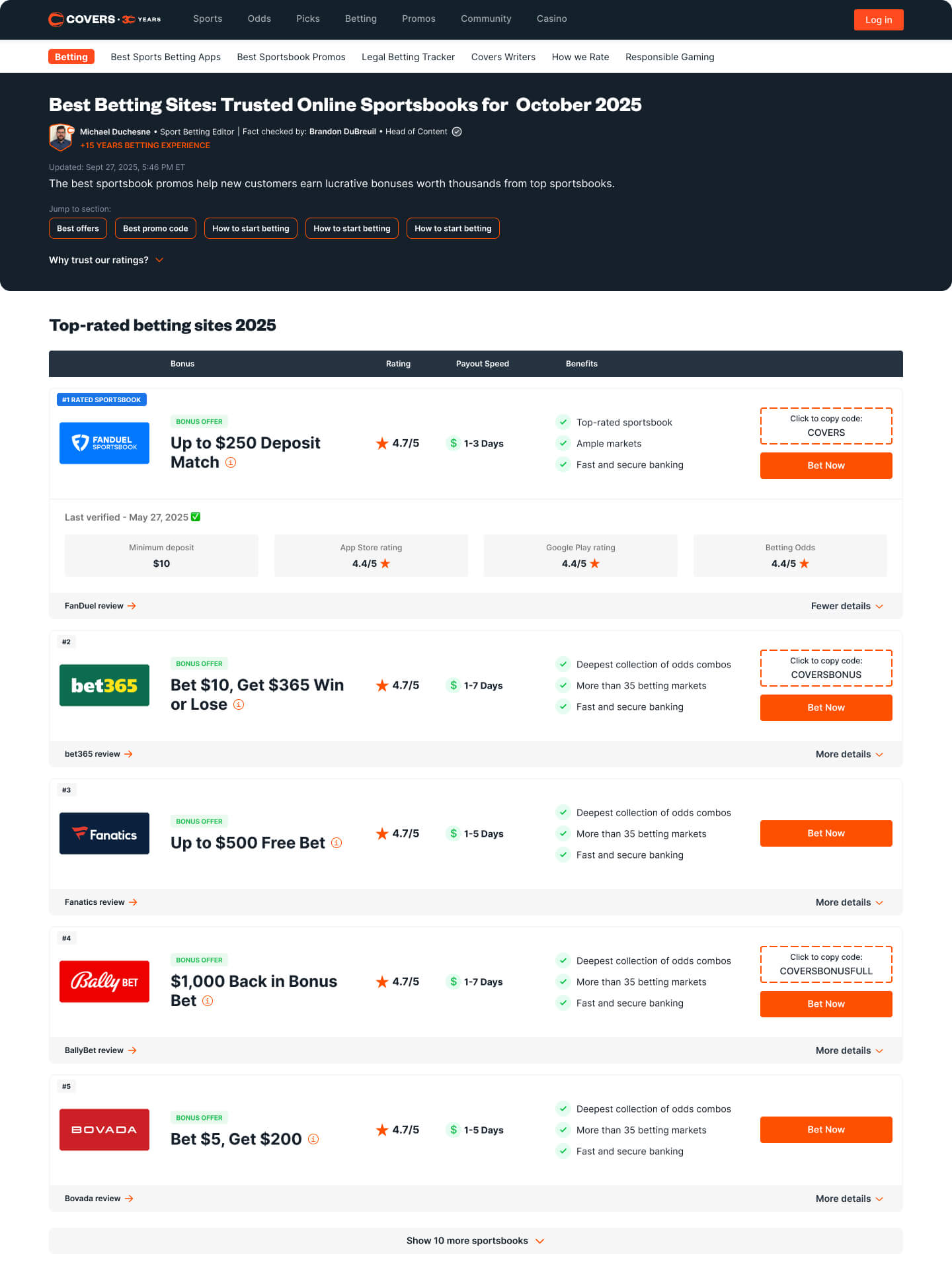
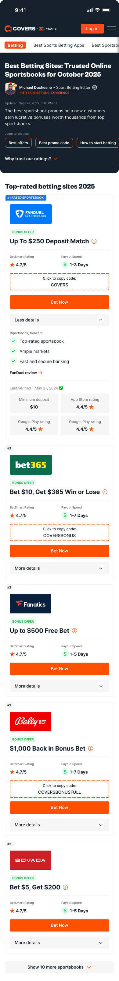
Covers is one of the world's longest-running sports betting information sites. Its commercial pages rank, compare, and recommend sportsbooks, and almost all of them are built on one shared component, the toplist. It is the first thing a User scans on the page, and the component they click out from to reach our sportsbook partners.
Improving the toplist improves nearly every commercial page at once. The real problem was that inside the toplist cards, there was no clear hierarchy, making it difficult to scan through information and even compare sportsbooks.
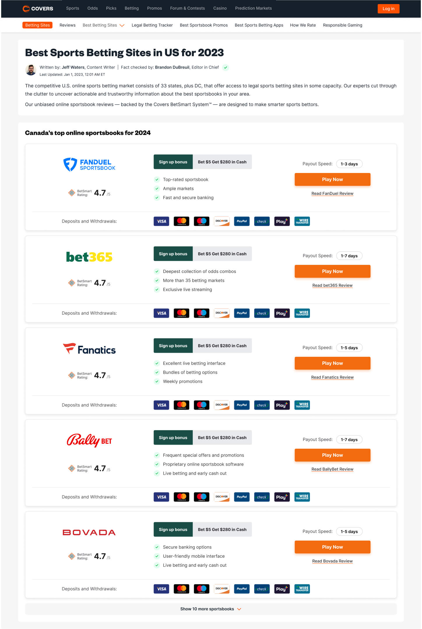
Getting more clickouts was the toplist’s primary objective. The card’s size and hierarchy made it difficult for Users to scan for the data they wanted and compare with other sportsbooks, preventing them from making a quick decision.
Section 02
I started by running a small interview session with around 20-30 Covers Users to understand how they actually move through a commercial page, then looked outside the sports betting industry for products that had similar experiences. From my findings, a few things came back clearly:
Just as useful was learning what did not move them. Ratings weren't as important, as Users already assumed that a sportsbook earning a place in a Covers toplist was trustworthy. Banking and deposit options barely registered, since Users expected every major sportsbook to support the common methods by this point. And when it came to trust, the experience of other Users counted for more than anything we said about ourselves, the same way a review outweighs a product description (this would come in handy later for our commercial pages).
For references, I looked at how other industries present dense, comparable options at a glance. Compare The Market, MoneySuperMarket, Go.Compare, and Google Flights all do the same thing well, giving one clear row per option, surfacing the few facts that matter, and tucking everything else away until you ask for it.
Across the interviews a few recurring data points emerged. Most Users came to scan quickly for a bonus, with payout speed close behind.
Section 03
My design work usually starts with an exploration phase, pulling all the card's elements onto the canvas and grouping them by priority. With the pieces laid out, I explored 3 low-fidelity directions, each making a different bet on how to organize the card.
Full Card. Kept the existing card whole, tightening the spacing to fit more entries per screen.
Condensed Info Block. Grouped the data into labeled blocks to make the card easier to read in chunks.
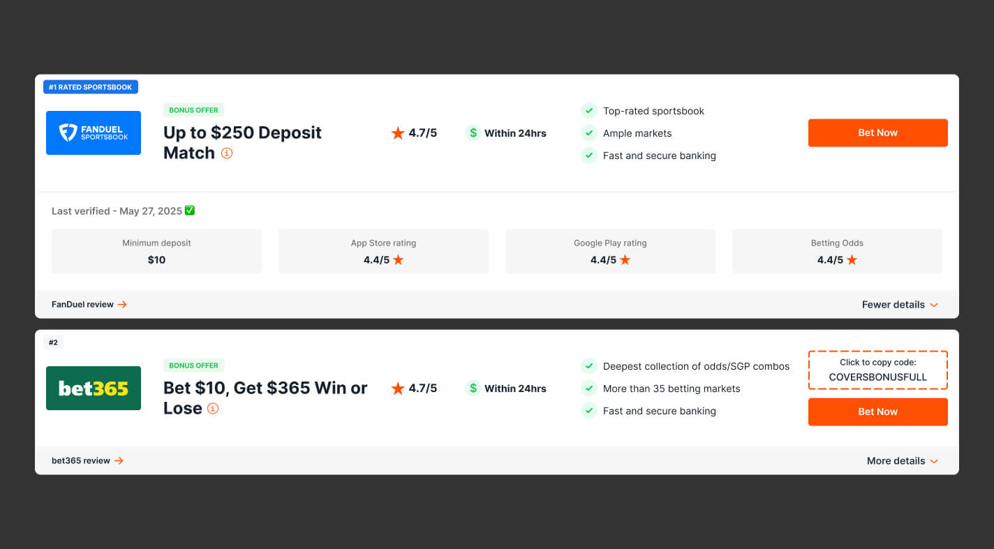
Table Layout. Rebuilt the card as aligned columns, leading with the offer, so the same facts line up across sportsbooks and stay easy to compare.
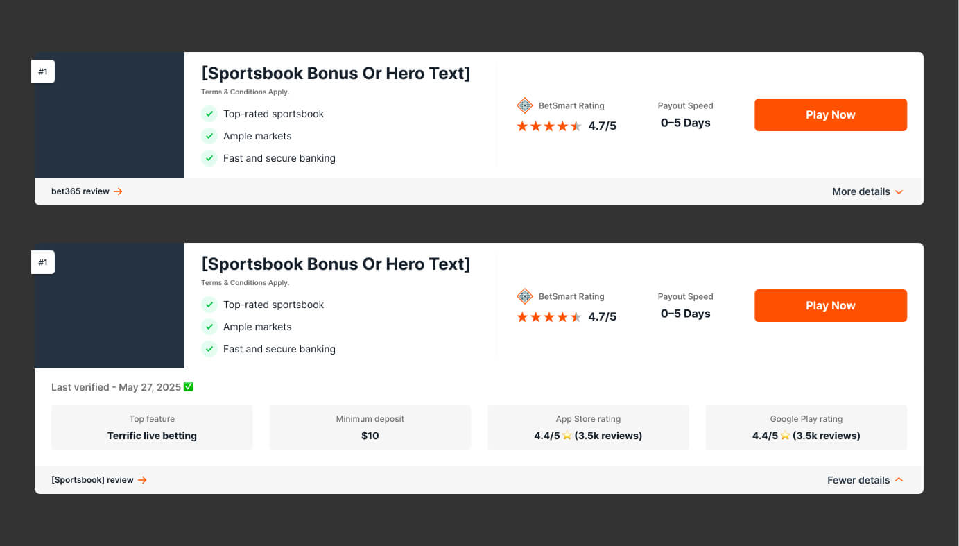
The Table Layout won, and the reason maps straight back to the research. It was the only direction that kept every data point easy to scan and easy to compare across sportsbooks. This is clearest on desktop, where the table structure lets Users lock onto a single data point and move up and down the column to compare it against the others.
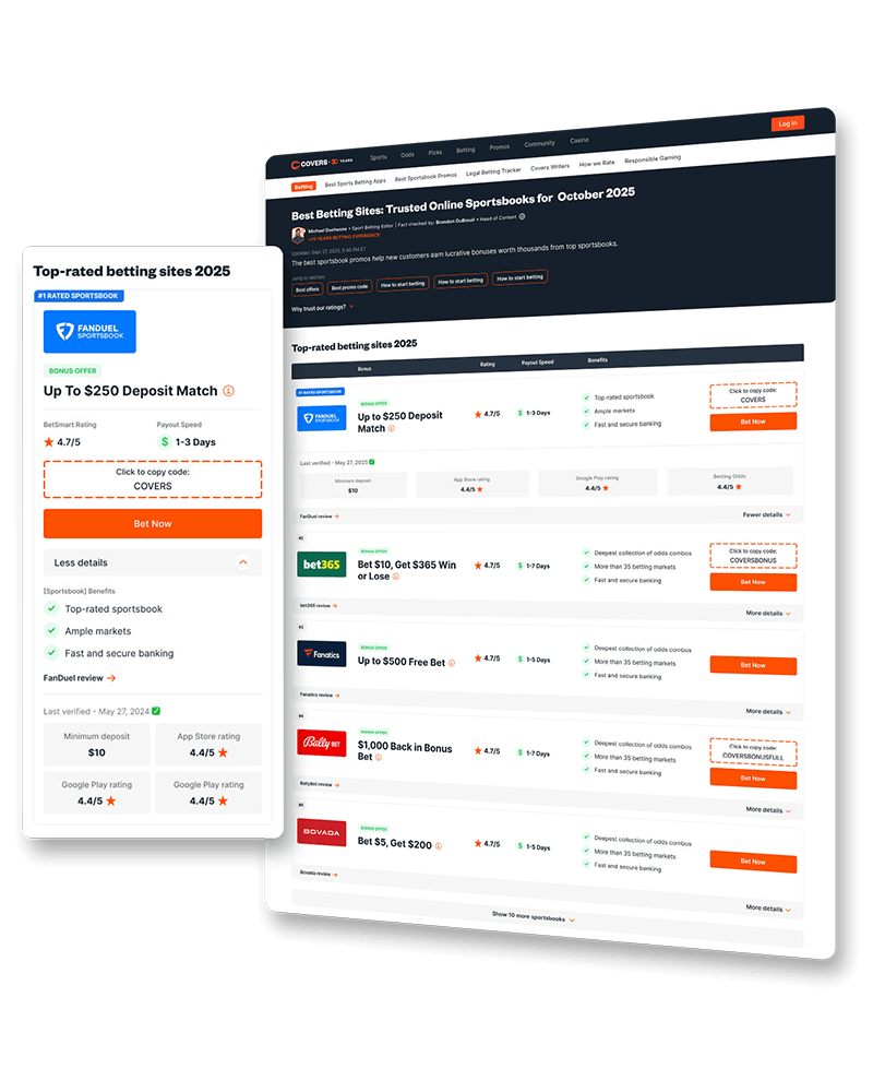
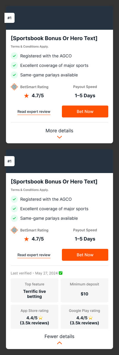
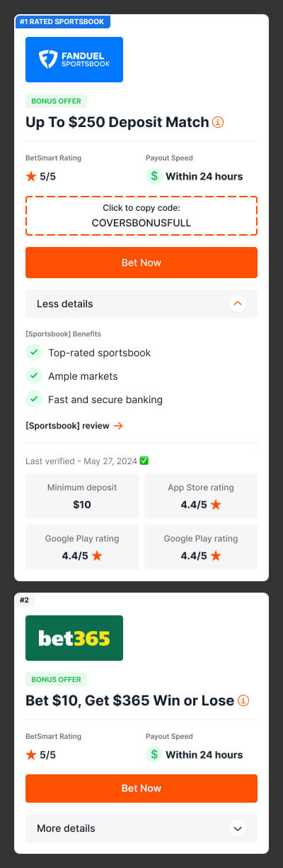
While closed, the card shows only what a User needs in order to compare and decide to click out. The offer, the rating, the few facts that matter, and the action. While open, it reveals the supporting detail for anyone who wants to go deeper. Built entirely from the Covers design system, the component uses its existing atoms, color tokens, and type styles, so it stayed consistent with the rest of the product and simple to hand off.
Section 04
Side by side, the redesign reads as a scannable table on desktop and a compact, collapsible row on mobile. The old card had a lot going on, while the redesign leads with a real offer and surfaces only what moves a decision. On desktop those facts line up in columns a User can scan straight down to compare, and on mobile the order collapses the card and drops everything else behind a details toggle. Either way the few things that matter lead, and more sportsbooks fit on screen.
Section 05
We tested the redesign as an A/B test against the old toplist on several pages. The new card lifted clickouts by roughly 35-45%, a massive win for the redesign.
The toplist worked well enough to spread beyond Covers as other brands in the Legend sports pillar picked it up as their own commercial standard, some dropping in the exact component restyled to their colors, others reshaping it into something of their own. A single-page redesign had become a template others built on.