Featured Project
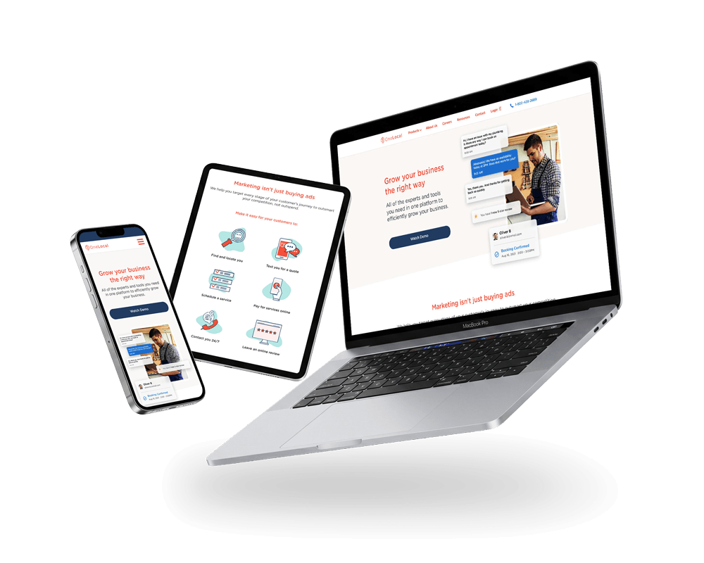
OneLocal Website
Rebranded online experience with enhanced visual design on all screen sizes and improved for accessibility.
OneLocal’s partner businesses ran scheduling on phone calls, spreadsheets, and handwritten notes. The dashboard replaces that with a digital system built around the Google Calendar and iCal mental models their staff already knew.

Section 01
Many of the small businesses we partnered with still handled scheduling through phone calls, spreadsheets, or whatever tools were available in the moment. It worked, but it wasn't fast, especially when clients missed calls or needed follow ups just to confirm a single appointment. These businesses weren't disorganized, they were busy and their existing tools weren't built for the pace of their day.
They needed a scheduling system that felt familiar, approachable, and easy to fold into their routine without a steep learning curve. The LocalBookings Web Dashboard was designed to meet that need. We leaned into patterns partners already recognized from tools like Google Calendar and iCal, making the interface feel intuitive from the first glance. And because our partners ranged from salons to dental offices to wellness clinics, the dashboard had to stay flexible while still being simple to use.
I led the design for this dashboard, shaping it to feel clean, predictable, and easy to trust. A tool that could help partners spend less time coordinating schedules and more time running their business.
These businesses weren’t disorganized, they were busy, and their existing tools weren’t built for the pace of their day.
Section 02
The people using this dashboard came from busy, hands on environments, such as stylists moving between clients, dental receptionists juggling schedules, wellness practitioners managing back-to-back sessions, and auto shop staff coordinating multiple jobs at once. Scheduling was just one part of their day, and most were handling it through phone calls, handwritten notes, or whatever tools they had nearby. These methods weren't failing them, but they slowed things down, especially when clients missed calls or needed multiple follow-ups to confirm a single appointment.
During early research, it became clear that partners wanted the benefits of a digital system without feeling like they had to learn a new one. They needed something that fit naturally into how they already worked. Through OneLocal's account managers, we gathered ongoing feedback from partners across different business types, and the themes were consistent:
The dashboard's purpose was to create clarity. A tool that felt dependable, predictable, and supportive of how these businesses naturally worked, not something they had to wrestle with.
Section 03
The goal was to create a scheduling dashboard that felt dependable and easy for busy teams to use in the middle of their day. Partners weren't looking for a complex tool, so they needed something that helped them stay organized without slowing them down. The design needed to feel familiar from the first interaction, reduce decision making friction, and support quick scheduling updates with as little cognitive load as possible.
Because so many partners were accustomed to using tools like Google Calendar or iCal in their personal lives, the design leaned on those established mental models to make the dashboard feel instantly comfortable. This allowed the experience to support the way small businesses already worked, whether someone was adjusting appointments between clients or managing a full day of back-to-back sessions. The strategy prioritized clarity, predictable interactions, and a layout that made sense across a wide range of business types.
The result was a dashboard that gave partners a clear view of their day and simple controls for keeping it up to date. Staff could review upcoming appointments, make quick edits, and handle last minute changes without digging for information. It supported the natural rhythm of small businesses, helping them move faster, stay organized, and feel more in control with every booking.
Section 04
For many partners, staying on top of appointments didn't always happen at a desk. The mobile dashboard supports those moments between tasks, such as checking today's schedule, confirming a booking, or making a quick adjustment. It offers the essentials in a simplified layout, giving staff a lightweight way to stay updated throughout the day without interrupting their flow.
Section 05
The desktop dashboard was designed for the day-to-day work of managing appointments. Staff needed a clear view of their schedule, quick ways to move between different timeframes, and dependable controls for making updates without slowing down their workflow. Each screen focuses on surfacing what matters at a glance, such as upcoming bookings, staff availability, and any changes that need attention, while keeping the interface calm and easy to move through.
Section 06
The dashboard rolled out smoothly with positive feedback from partners and OneLocal's account managers. Staff appreciated having a clearer view of their day and a faster way to make changes without relying on phone calls or scattered tools. It reduced small scheduling errors, made last minute updates easier, and helped teams feel more confident handling their bookings digitally.
The shift to a digital system made a noticeable impact:
Designing the dashboard alongside the consumer experience sharpened how I think about connected systems. What customers see when they book directly shapes how a business manages those appointments behind the scenes, so every decision had to support both sides of the journey.
It also reinforced how much clarity and predictability matter for partners transitioning from manual workflows. When a tool is straightforward and dependable, it's easier to adopt, easier to trust, and easier to fold into the rhythm of a busy day.
Building these experiences in parallel gave me a deeper appreciation for how tightly they rely on each other. When the booking flow and the business dashboard stay in sync, the entire system feels smoother for everyone.
Rebranded online experience with enhanced visual design on all screen sizes and improved for accessibility.