
Covers Review Page
Designing for Intent
A research-driven redesign anchored in user-intent signals, giving the above-the-fold a focused job instead of asking it to carry everything.
UI DesignUX ResearchDesign SystemResponsive Design
A white-label referral platform that adapts to any brand, built to launch branded campaigns across web, email, SMS, and print without rebuilding from scratch.
Section 01
Word-of-mouth has always been one of the strongest ways small businesses grow, but most of our partners had no structured way to encourage it. Referrals happened casually, if at all, and the few tools available on the market were either too rigid to match a partner's brand or too complex for a small team to run on their own.
LocalReferrals set out to change that. The goal was to give partners a referral system they could launch quickly, customize confidently, and place wherever their customers actually were, on their website, in an email, in a text message, or on a poster near the front counter. One program, many surfaces, always on brand.
As OneLocal's sole designer, I shaped the foundational framework that would let every partner feel like they had something built just for them, without the team having to design each campaign from zero every time.
Existing referral tools were either too rigid to match a partner’s brand, or too complex for a small team to run on their own.
Section 02
LocalReferrals served 2 audiences at once. Partners were small business owners and their account managers, who needed to launch and adjust campaigns without design help for every tweak. Their customers were the advocates doing the actual referring, who needed a quick, trustworthy way to share a link and claim a reward.
Early conversations with account managers and partners surfaced a consistent set of expectations. Both sides wanted the experience to feel simple, familiar, and tied to the business customers already recognized.
Those themes pointed to a single design priority: build the flexibility into the system itself, so partners wouldn't have to wrestle with the tool to make it feel like their own.
Section 03
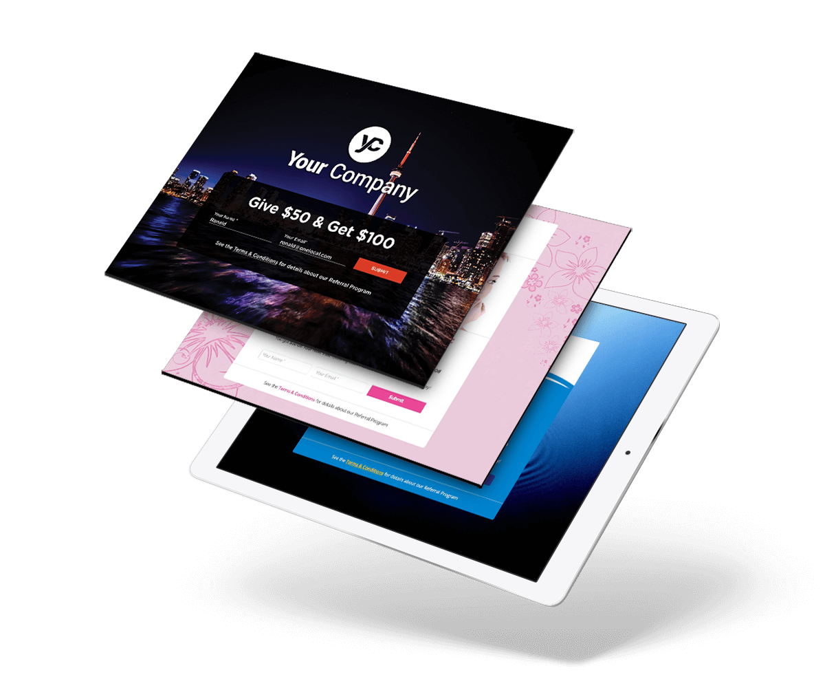
The strategy came down to separating what stayed consistent from what needed to flex. The underlying flow, enter your info, share a link, claim a reward, stayed the same for every partner. Everything on top of that, from colours and typography to imagery and voice, had to be easy to swap without touching the logic underneath.
I built the foundation on a 12-column responsive framework with targeted CSS that isolated the customizable surfaces from the structural ones. Colours, imagery, copy blocks, and hero treatments lived in a clearly defined theming layer, which meant account managers could onboard a new partner by adjusting a focused set of variables rather than reworking entire layouts. The result was a product that looked custom to every partner but stayed predictable for the team running it.
Designing for channel-parity was the other half of the strategy. From the first wireframe, every screen was planned against a matching treatment for email, SMS, and print, so partners could run a coordinated campaign instead of piecing together disconnected assets.
Section 04
Every partner had a different look, voice, and customer base, so the product had to disappear into whatever brand it was serving. During onboarding, account managers set up the theming with each partner, choosing colours, imagery, and copy that matched how the business already spoke to its customers.
The same underlying campaign could feel upscale for a professional services firm, warm for a family-run shop, or bold for a modern lifestyle brand. None of those variations required new engineering work. They were all expressions of the same system, styled through the theming layer.
Section 05
Referrals rarely happen in one place. A customer might see a poster at the counter, mention it to a friend over text, and land on a branded web page to sign up. LocalReferrals was designed around that reality. Instead of treating the web product as the main event and everything else as an afterthought, each surface was designed as a first-class channel from the start.
Together, the channels formed a connected loop. Customers discovered the program on the web or in store, shared it through email or SMS, and advocates returned to a branded page to complete their referral. Every touchpoint looked like it came from the partner, not from a platform sitting behind the scenes.
In-store poster, a text-to-join entry point
SMS invite
Mobile sign-up
Section 06
LocalReferrals gave OneLocal a referral product that partners could launch quickly and recognize as their own. Account managers had a clear, repeatable path to onboard new campaigns, and partners could point their customers to a consistent experience no matter which channel brought them in.
Bright Kids, a New York tutoring center. View the OneLocal case study
LocalReferrals sharpened how I think about flexibility. The value wasn't in how many options the system offered, but in how cleanly the customizable surfaces stayed separated from the stable ones, letting the product feel bespoke at the edges and dependable at the core.
It also showed how much channel-parity matters for local businesses. The more surfaces a campaign lives on, the more credible it feels, and the easier it is to act on in the moment.