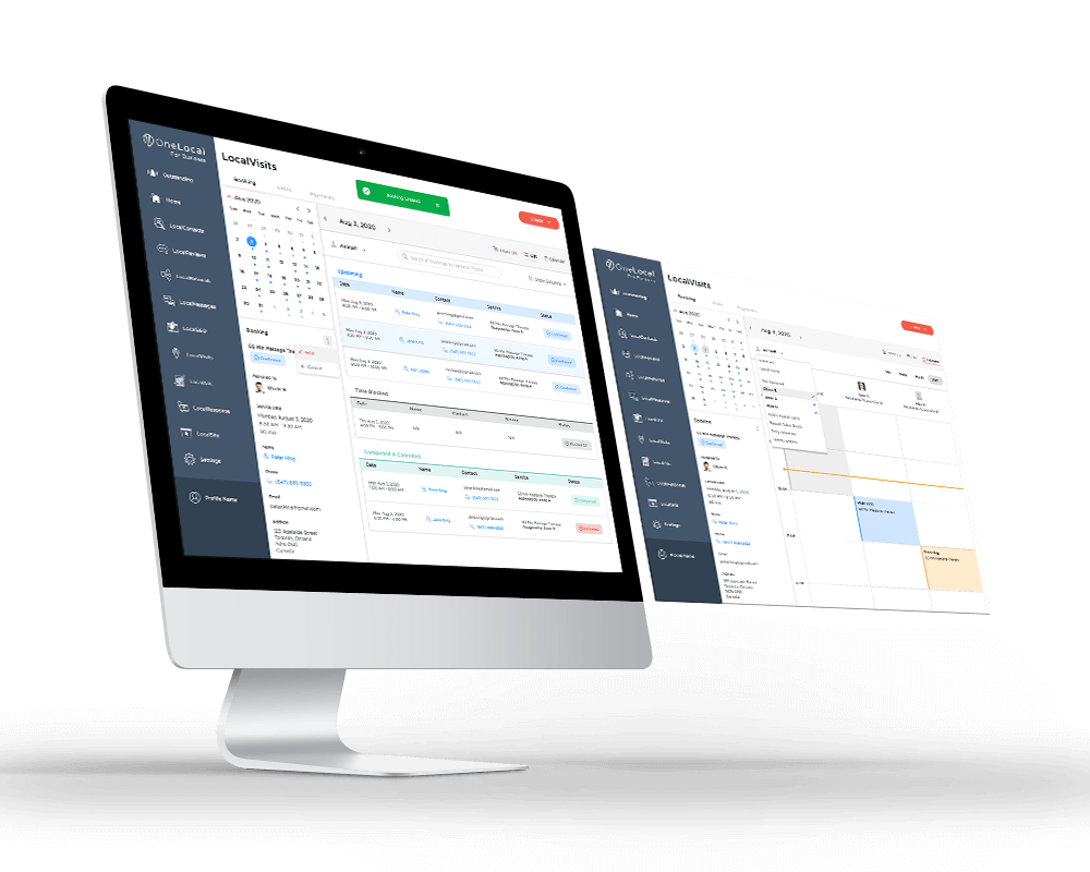
OneLocal Booking Dashboard
A scheduling dashboard built on the calendar model partners knew, leading with an agenda on mobile and the full grid on desktop.
Product DesignUX ResearchDashboard UIResponsive Design
I designed a self-serve web flow that lets Users book in a few simple steps, themed to match OneLocal partner brands.
Section 01
OneLocal (YC S17) builds software that helps local service businesses manage their websites, customer relationships, online bookings, payments, and digital advertising all in one place.
An opportunity arose when we identified that for most partners, booking still ran on manual back-and-forth. A customer called during business hours, someone checked the calendar, and together they landed on a time. It worked, but it didn't scale, and someone who wanted to book after hours had to wait until the office opened.
OneLocals' User booking web app, LocalVisits, set out to replace that with self-serve booking that made the process simpler and able to run anytime the customers wanted. As OneLocal's lead designer, I owned both halves of the project. The customer-facing User booking flow, and the business dashboard that ran it behind the scenes.
Booking only worked while the office was open. Customers wanted to book on their own time, day or night, and a phone call couldn’t give them that.
Section 02
I had a direct line to a few partner businesses, so I could hear owners talk through their booking process firsthand, and I worked alongside our account managers, who spoke with local businesses every day and relayed what owners and their customers kept running into. I synthesized both into an affinity diagram to find the patterns underneath.
A handful of needs surfaced again and again, and they held up across very different businesses:
Section 03
The goal was to guide people through a simple, predictable flow that feels comfortable whether someone is tech savvy or not. Most customers just want to choose a service, see what times are available, and confirm their details without overthinking the interface. I kept the steps focused and familiar, showing availability early and using clean layouts that make each decision feel natural.
Before designing a single screen, I studied the established booking tools in the industry, mainly JaneApp and Mindbody, to decide which patterns to keep. Those patterns were familiar to anyone who had booked an appointment online before, so I stayed close to them and let the experience feel recognizable from the first screen.
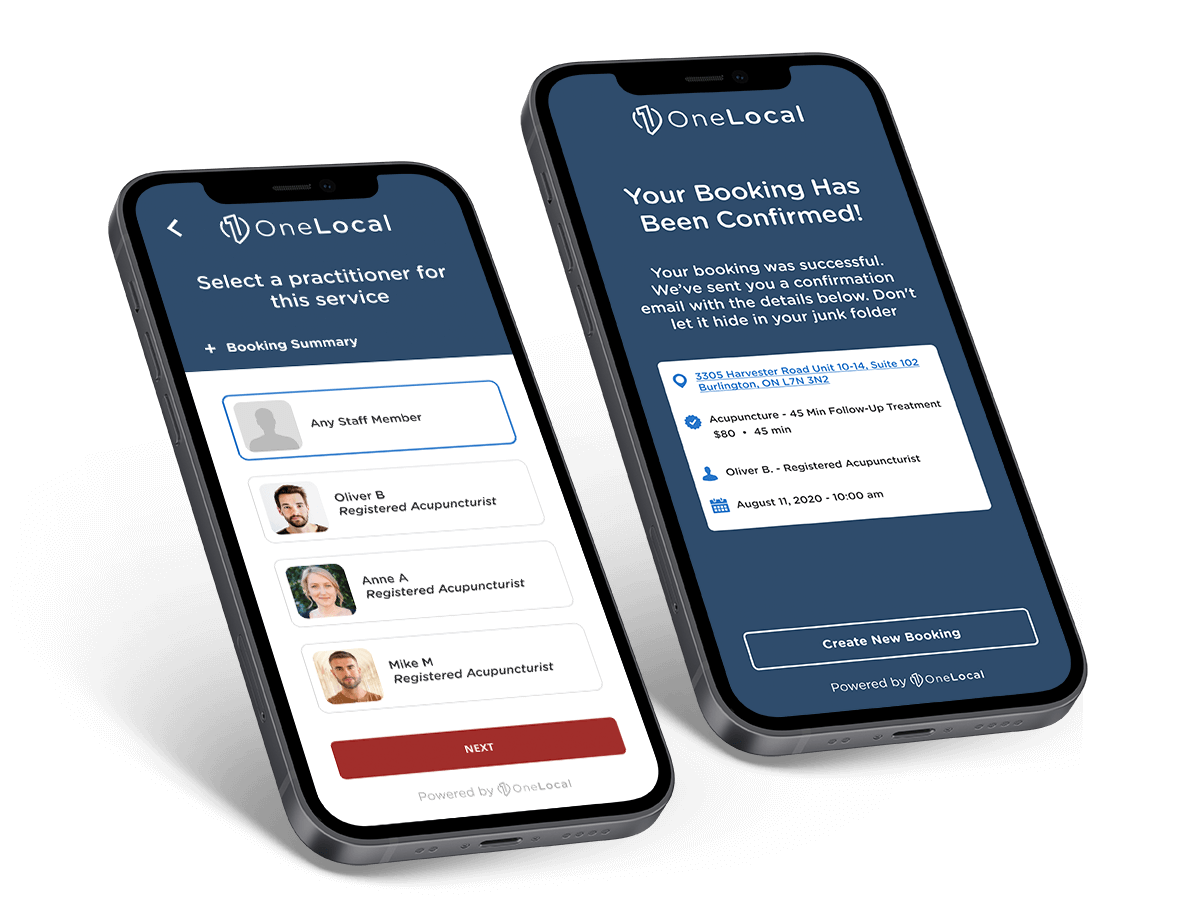
The result is a straightforward journey: choose a service, pick a staff member, select a time, and confirm your details. A reminder goes out automatically, and on the business side, owners can view and manage bookings directly from their dashboard. It keeps the experience lightweight for customers while reducing the amount of messages for business owners.
One flow could work for dental offices, salons, and wellness clinics, because underneath it all they were doing the same thing: booking an appointment. The differences lived on the business side, so that's where I put them. Partners could hide or edit pages in the flow to match how they actually worked, which kept the customer's path simple instead of cramming every business's quirks into it.
I was building both sides of LocalVisits at the same time, the customer flow and the business tools, as the lead designer working with 2 developers, one on the consumer side and one on the backend. It also had to live inside OneLocal's existing platform and match what was already there. All of that pushed me toward a flow that was dependable and conventional, and toward handling each business's differences through settings instead of a more complicated interface.
Section 04
I designed the mobile experience for quick, on-the-go booking. Most customers were already used to doing everything from their phone, so the flow focuses on a small number of clear steps: choose what you need, see when it's available, and confirm. Each screen keeps the layout focused and familiar, so booking an appointment feels fast and lightweight instead of like filling out a long form.
Section 05
On desktop, the same journey opens up to a larger canvas, giving customers more room to review details before confirming. The steps stay consistent with mobile: select a service, pick a time, add your information, and finish. The layout makes it easier to scan, compare options, and feel confident about the booking from start to finish.
Section 06
I paired every booking step with a matching transactional email, built with the same clarity as the product itself. Four core templates cover the full lifecycle of a booking.
Section 07
Because LocalVisits was white-label, it had to adapt to any partner's brand and colors. We set default styles that felt clean and modern, and during onboarding, our account managers selected colors with partners so the product felt like a natural extension of each business. No complicated theme system, just thoughtful styling that worked for everything from beauty salons to auto shops.
EXAMPLE PARTNER
Soft, calming palette with warm accent, tuned for healthcare clients where trust and clarity matter most.
EXAMPLE PARTNER
Clean, clinical blues with bright accents, reinforcing professionalism and modern care.
EXAMPLE PARTNER
Grounded earth tones with a confident accent, approachable for a specialty practice.
EXAMPLE PARTNER
Bold, expressive palette with a pop of accent, energetic for beauty and lifestyle brands.
Section 08
LocalVisits shipped to beta partners as the booking layer of OneLocal's product suite. The aim was to make self-serve booking available to customers. What the design changed was concrete:
The results were positive. Website engagement and booking volume grew as more customers moved online. Today, I'd watch for two things, rebooking rate, in order to learn whether the experience was good enough to bring customers back, and time-to-complete, in order to confirm people moved through the flow instead of stalling partway.
What I'd carry forward is the shape of the work. I mapped the full journey before drawing a single screen, and I designed the customer flow and the business dashboard in parallel, treating the customer's path and the owner's tools as two halves of one product rather than two projects.