
Personal Project
Designed and Built From One Source
The portfolio you’re on now, designed system-first in Figma, then hand-coded so design and build share one source of truth.
Product DesignDesign SystemAccessibilityUI Design
These sportsbook review pages were clicking out well below Covers’ best commercial pages. The assumed fix was a heavier top, but research pointed the other way, so the redesign leads with less and gives the clickout the room it needs.

Section 01
Covers is North America's go to source for sports betting information, with more than 25 years of experience and roughly 20 million visits a year from bettors who arrive to research, evaluate, and make decisions on sports betting.
These review pages clicked out at roughly a fifth the rate of Covers' best commercial pages. A clickout is an outbound click to a sportsbook. This is the action the commercial pages are measured on. The business wanted to close that gap with an adjustment above the fold (ATF), the first screen Users see before scrolling. The brief carried a core belief: give Users everything they need near the top so they can decide quickly.
That belief had never been tested against how Users actually use the page. So before adjusting the layout, I led the research synthesis, explored design directions, and prepared the handoff for engineering. The working hypothesis was simple: if the top carries more, clickouts rise. The research pointed the other way.


These pages were clicking out well below our best commercial pages, and the assumed fix was to give the top of the page even more to do.
Section 02
Users arrive from organic search or from internal sportsbook toplist cards. By the time a User lands on a review page, their intent to engage with the page is already high. Users have opted to spend time investigating a sportsbook before deciding whether to sign up.
The analysis covered 8 sportsbooks: 4 established books (Bet365, BetFanatics, FanDuel, Caesars) and 4 newer ones (theScore, PrimeSports, Betr, Kalshi).
Hotjar heatmaps showed us that Users were making their way down a good portion of the page. Combined with mouse movement and mobile tap data, the picture flipped. Users were actively reading the content. Mouse paths zeroed in on banking options, FAQs, and state availability deeper down the page, while mobile taps clustered around specific data points rather than scrolling through indifferently. Users were engaged, but selective.
For industry references, I looked at established sites like Legal Sports Report, Casino.org, and Sports Betting Dime to see how they compared to our review pages. I then took a look outside the sports betting industry, as I made a connection between the way Users review sportsbooks and the way they review products.
The references all showed that we don't need to overload the ATF with too much data, plus a clear pattern emerged: Product → Data → CTA. My analysis pointed away from more and towards less.
Findings indicate that these pages are bringing in mostly “DIY Bettors”. Bettors who took time to do their own research and evaluation. If they came here, they have some high level of interest.
Section 03
With User intent locked in, exploration followed a 10/50/90 approach, raising fidelity in stages so each round of feedback matched how finished the work was. The first pass explored directional layouts as wireframes, the second narrowed them into 2 mid-fidelity variations.
There were 3 directions that explored the spectrum from familiar to closer alignment with the newer design system that was being implemented at the time.
Direction A: Familiar card style. Same spirit as the current design. Page meta below the card. Strong visual hierarchy. Clean, organized, low-risk.
Direction B: Ranking-card aligned. Borrows the newer commercial page pattern from the bonus pages. Page meta pushed below the most important data points. Card-style retained, but data-led.
Direction C: Hybrid. A mid-point exploration combining the card-style chrome of A with the data-led ordering of B.
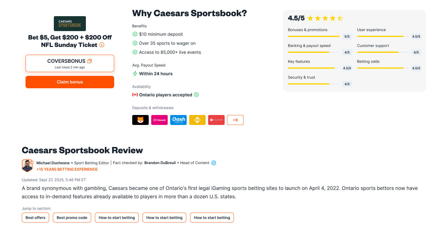
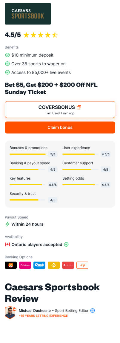
From there, I refined the directions into 2 variations. The structural decision driving both was the data-point hierarchy, making explicit what belongs in the ATF, what gets supporting weight, and what moves out:
Primary: Logo, rating, bonus text, primary CTA, promo code.
Secondary: Payout speed, country availability, and banking options (deposits + withdrawals).
Tertiary: H1, review author, jumplinks, and rating breakdown.
Section 04
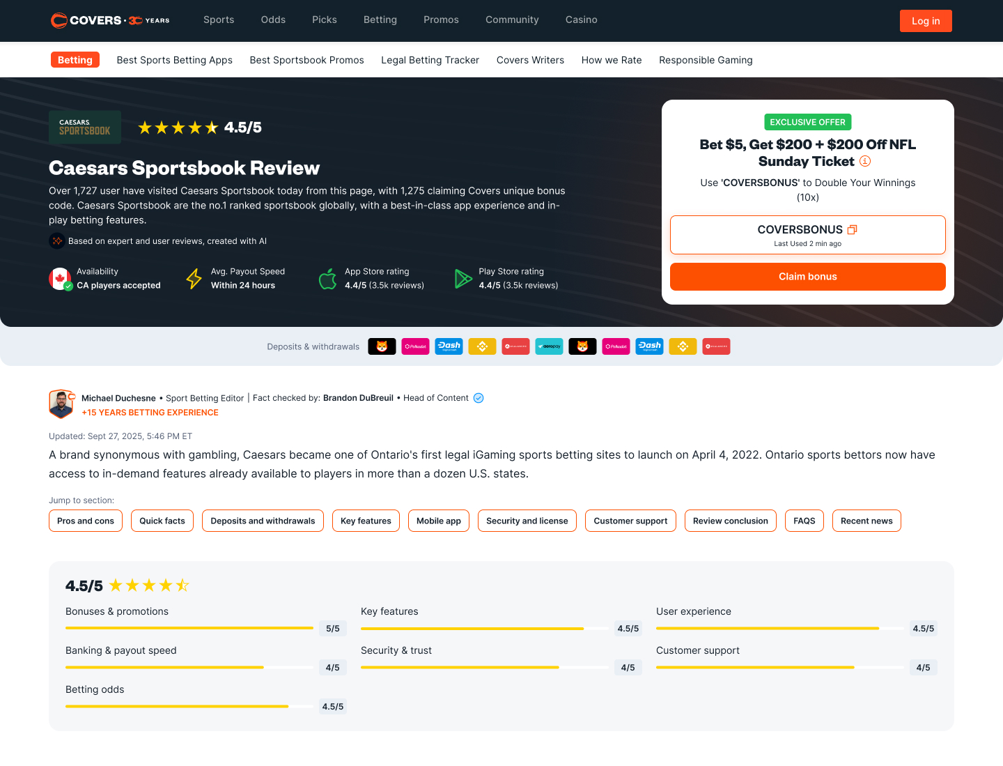
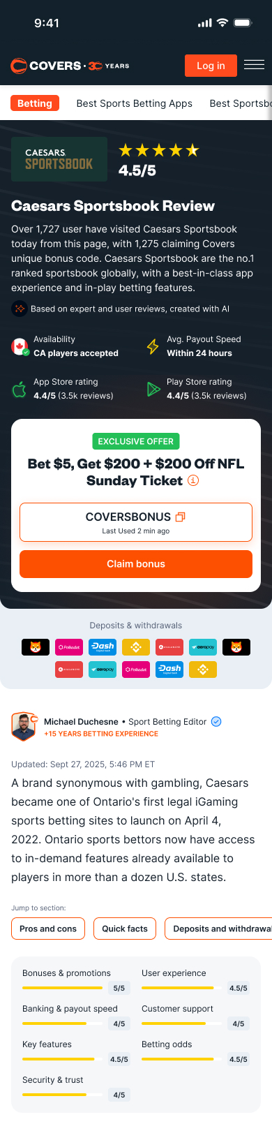
The final layout is intentionally reduced. Users had already demonstrated willingness to scroll. Overloading the fold wouldn't increase clickouts; it would weaken the information's value and create a poor first impression. The primary CTA has more clarity when the ATF carries less, not more.
The reduced layout includes logo, rating, primary promotion with CTA, supported by a short review summary, up to 4 key data points, and banking options as a footer within the ATF. Patterns from the newer commercial page system carry through, aligning these review pages with the rest of Covers' commercial surfaces.
The review breakdown, originally kept in the ATF to reinforce the overall rating, was relocated to the first section after the ATF. Its visual weight competed with elements that more directly support the primary CTA, and since Users scroll the page anyway, placing it in the ATF didn't meaningfully increase clickouts.
Max ATF data points: Maximum of 4, prioritized in this order: Availability, Avg. Payout Speed, iOS App Store Rating, Android Play Store Rating. If either app rating is unavailable, fill from the next data point but keep to a max of 4.
"Top Feature" treatment: Used for geo locations where bonuses cannot be shown (e.g. Ontario), keeping the ATF promotion slot useful instead of empty.
Review summary typography: Body 14px, footer 12px, same sizes across desktop and mobile, since the section is meant to give a quick synopsis at a glance.
Persistent offer CTA is required: Desktop floats to the right of the viewport; mobile floats at the bottom. The persistent clickout path was a recurring signal in the references and is now a required pattern for this page family.
Capturing the spec at this level comes from my front-end background. This is how I keep the back-and-forth short and the shipped UI faithful to the design.
Section 05
The thesis was simple in the end: less, not more. The comparison below makes the shift legible at a glance. Drag, hover, or use your arrow keys to move between the live and the redesigned page.
The data points narrow, the page meta finds its place, and the primary CTA gets the room it needed all along.




Section 06
The instinct walking in was the obvious one: the top of the page needs to do more. The data taught the opposite. With Users already willing to scroll, the most useful move was to take pressure off the fold and let the rest of the page do its job.
Triangulating signals was decisive. Heatmaps, mouse movements, and tap data showed a bigger picture of engaged reading. Either signal in isolation would have been misleading; the engaged-but-selective read only emerged from the combined view. Recordings confirmed the pattern.
The durable lesson is the framing: design for intent (what the User is here to do) over real-estate optimization (cramming the visible viewport). It applies well beyond review pages.
The design is complete and currently in Covers' engineering backlog awaiting capacity. When it ships, 3 hypotheses are queued for validation: