
LocalVisits
Booking Without the Phone Call
Booking flow for any business, themed to each partner’s brand, where each business tunes its own settings so the flow stays simple for customers.
UX ResearchBooking FlowWhite LabelUser Flow
A personal portfolio rebuilt as a real design system: foundations in Figma, reusable components, dual-theme support, and a hand-built frontend.

Section 01
This project started with a simple goal: redesign my portfolio in a way that better reflects how I think and work now. The previous version still served its purpose, but I wanted the site itself to become a clearer example of my design process, not just a container for finished work.
More specifically, I wanted to show the parts of the work that are easy to miss in a polished final screen: the system thinking, the design decisions, the way pages relate to each other, and the handoff between visual design and frontend implementation. That made the redesign a useful project in its own right, because the portfolio needed to communicate both the outcomes and the process behind them.
From the start, I knew this was more than a visual refresh. I wanted a portfolio that behaved like a product: a clear visual language, a reusable design system, and a frontend build that preserved the logic of the design instead of flattening it.

The redesign was less about replacing the old site and more about creating a portfolio that could show the process behind the work.
Section 02
Before designing anything, I reviewed a range of product design portfolios from designers in Canada and the United States. I focused on homepages and at least one detailed project page for each site, looking at layout, typography, color, case study structure, writing style, navigation, and the overall sense of personality.
The strongest examples shared a few patterns: concise introductions, restrained visual systems, project pages with a clear problem-to-outcome narrative, and enough personality to feel authored without distracting from the work. Just as important, they made the process visible through headings, summaries, research, diagrams, and reflections.
That research translated into a set of principles I committed to before opening Figma:
Reviewing other portfolios made the opportunity clear: build something more structured, more personal, and more process-forward.
Section 03
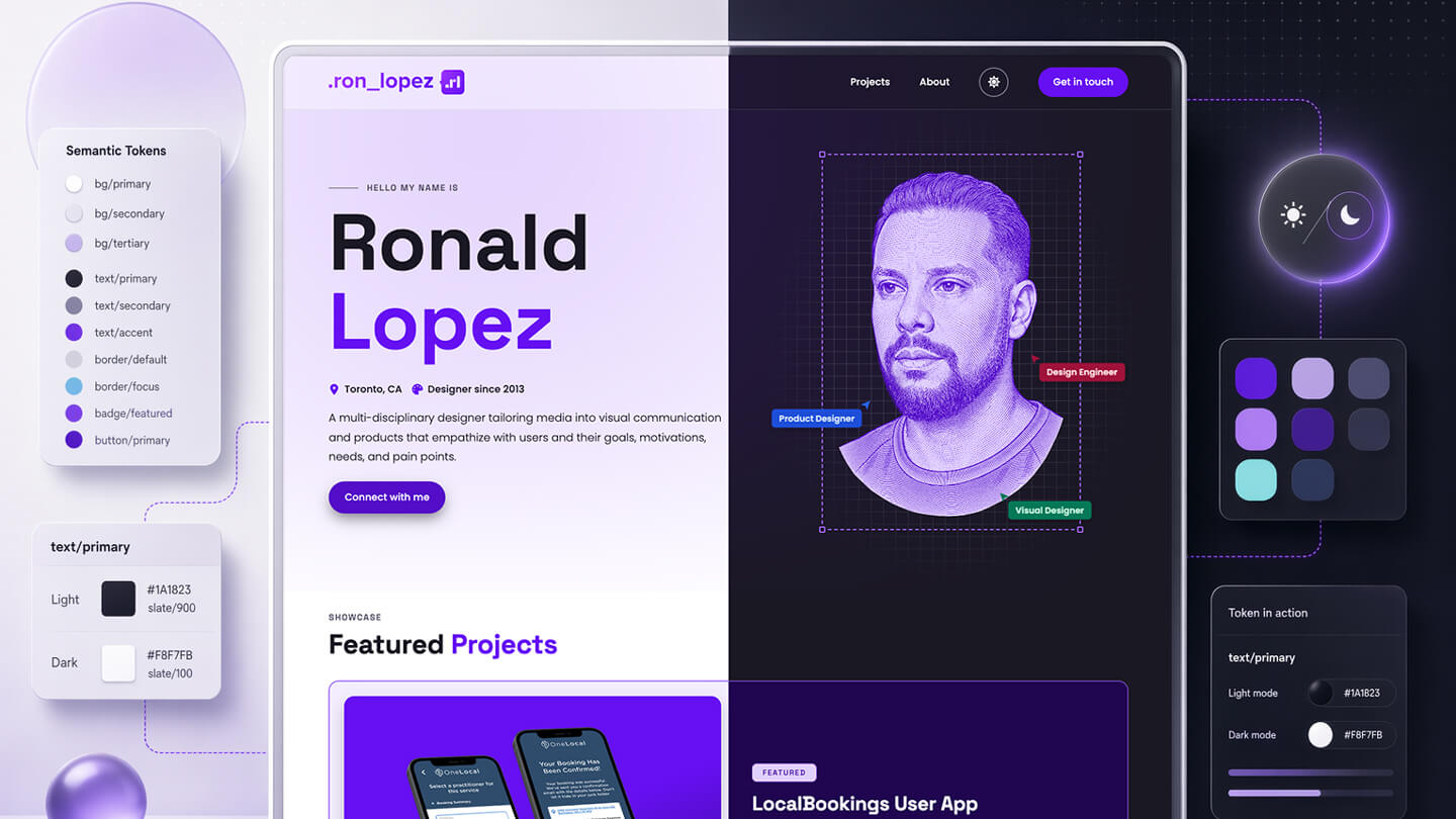
Tokens did most of the work at this stage. I built primitives for the raw values, then semantic tokens for how those values behave in the system. Figma variables and styles became the source of truth, and the naming stayed practical: roles like bg/surface, text/primary, and border/focus instead of loose visual guesses.
That structure shaped more than color. Typography, spacing, radius, borders, focus, and shadow all followed named scales, so both the design files and the frontend had a shared vocabulary. Pages never reach for primitives directly. They only consume the semantic layer.
Purple remained the signature, but it stopped carrying the entire site by itself. Ocean adds contrast, Slate handles structure, and the supporting state ramps give feedback and status their own vocabulary. That made the palette feel intentional instead of decorative.
Space Grotesk
Space Grotesk
Space Grotesk
Space Grotesk
Space Grotesk
Poppins Light reads well at long lengths and leaves room for the headings to lead.
Poppins at 16px is the default throughout the site line-height 1.75, calm and unhurried.
The type system has distinct jobs. Space Grotesk handles display moments, navigation, and labels with enough character to give the portfolio a voice. Poppins carries the reading experience across longer case-study pages without fighting for attention.
Before I built anything on top of these tokens, two things had to hold at the token layer: they needed to stay legible, and they needed to work in both themes. Accessibility and theming came first, before the components.
Section 04
I treated accessibility as part of the design, not a pass at the end. When I set the color tokens, I checked each text and background pairing against WCAG contrast, so the system starts from legible defaults instead of correcting them later. Dark mode had to clear the same bar, which is part of why the accent moves to a lighter purple there: it keeps enough contrast on a dark surface.
I carried the same approach into the smaller details. The focus ring is its own token, an ocean color I picked so it stays visible in both light and dark instead of leaning on the browser default. Motion follows the reduced-motion setting, so the reveals and transitions on the page ease off for anyone who would rather have less movement.
Section 05
Dark mode was planned at the token layer, not patched in afterward. Because components bind to semantic roles instead of raw hex values, supporting a second theme came down to defining a parallel set of semantic values and letting the rest of the system inherit them.
The theme system works through 3 clear states, so the site can respect user preference without adding visual drift or duplicated component logic.
Section 06
Once the tokens were stable, I turned them into a component library. Buttons, badges, navigation, project cards, heroes, and supporting UI all reference the same semantic layer. That is where the design system starts to prove itself: the components carry the brand, the hierarchy, and the theme logic without needing one-off styling every time.
This mattered because the portfolio mixes very different content types. The same library has to support landing-page moments, index cards, navigation, long-form case studies, and utility patterns. Building the components first made those variations feel related instead of bespoke.
Section 07
Page design was where the system got tested. I defined a small set of page types for the portfolio: home, about, projects, and project detail. Each one uses the same foundations and components, but with different pacing, density, and content priorities. That balance is where the design system stops being theory and starts behaving like a real product language.
Designing the pages this way made the system visible. Repeated structure became a strength, not a limitation, because the differentiation came from content, sequencing, and emphasis rather than new UI for every screen.
Section 08
The frontend needed to preserve the system rather than reinterpret it. I kept the stack intentionally simple so the structure stayed legible: Pug for templates, LESS for styling, vanilla JavaScript for behavior, and a small custom build script to compile the site without adding unnecessary abstraction.
That simplicity matters because the design system survives implementation. Shared mixins handle repeated structure, LESS variables mirror the token language, and new project pages start from composition instead of a blank canvas. Nothing stays trapped in Figma. The same modular thinking carries through the build, from named variables to reusable templates to the final rendered pages.
To keep those mixins honest, the same components are catalogued in a live Storybook. It is not a separate copy of the UI. A small Vite plugin compiles the exact Pug mixins from the site, so each story renders the real component, not a reproduction, and the catalog stays a development layer that never touches the shipped build. There the system can prove itself on its own terms, with each component flipping between the real light and dark themes, running against an accessibility panel, and guarded against visual regressions through Chromatic, all reading live from the same token build the site ships.
Section 09
The clearest outcome was not just a more polished portfolio. It was a reusable system I can keep extending without diluting the brand or re-solving the same layout problems. Once the foundations and components existed, new pages became much more about story and sequencing than about rebuilding UI.
That changed the maintenance story as much as the visuals. New case studies can borrow proven patterns, dark mode stays aligned across the site, and visual decisions remain tied to named tokens instead of memory or instinct. The site feels more personal now, but it is also much easier to evolve.
For this project, the design system is the result. The finished pages matter, but the stronger outcome is that the portfolio now has a foundation sturdy enough to carry whatever comes next.