Featured Project
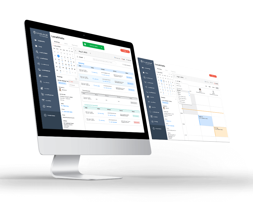
LocalBookings Dashboard
The companion dashboard that powered this consumer experience, where partners manage bookings, availability, and staff.
Customers of OneLocal’s partner businesses booked appointments by phone. The User App replaces that with a 5-step web flow themed end-to-end to match each partner’s brand.
Section 01
Many of our partner businesses still relied on a lot of manual coordination to handle bookings. It works, but like most things that are manually done, it's not scalable. Customers wanted to book services quickly, on their own time, without waiting on calls.
LocalBookings focused on giving their customers a clean, web based booking experience that felt simple, friendly, and familiar. Most importantly, it didn't require waiting on the phone. Whether someone was booking a dental appointment, or a haircut, the goal was the same. Make the process fast, intuitive, and stress free.
I led the product design for the consumer side while also designing the companion business dashboard that powered it behind the scenes.
On the business side, most partners weren’t used to automation tools, so the design had to feel natural, familiar, and not overwhelming.
Section 02
Our users were customers booking haircuts, dental visits, and everything in between. The needs were surprisingly consistent:
I received partner insights through our account managers, who worked closely with local businesses and helped translate real operational needs.
Section 03
The goal was to guide people through a simple, predictable flow that feels comfortable whether someone is tech savvy or not. Most customers just want to choose a service, see what times are available, and confirm their details without overthinking the interface. I kept the steps focused and familiar, showing availability early and using clean layouts that make each decision feel natural.
The result is a straightforward journey: choose a service, pick a staff member, select a time, and confirm your details. A reminder goes out automatically, and on the business side, owners can view and manage bookings directly from their dashboard. It keeps the experience lightweight for customers while reducing the amount of messages for business owners.
Section 04
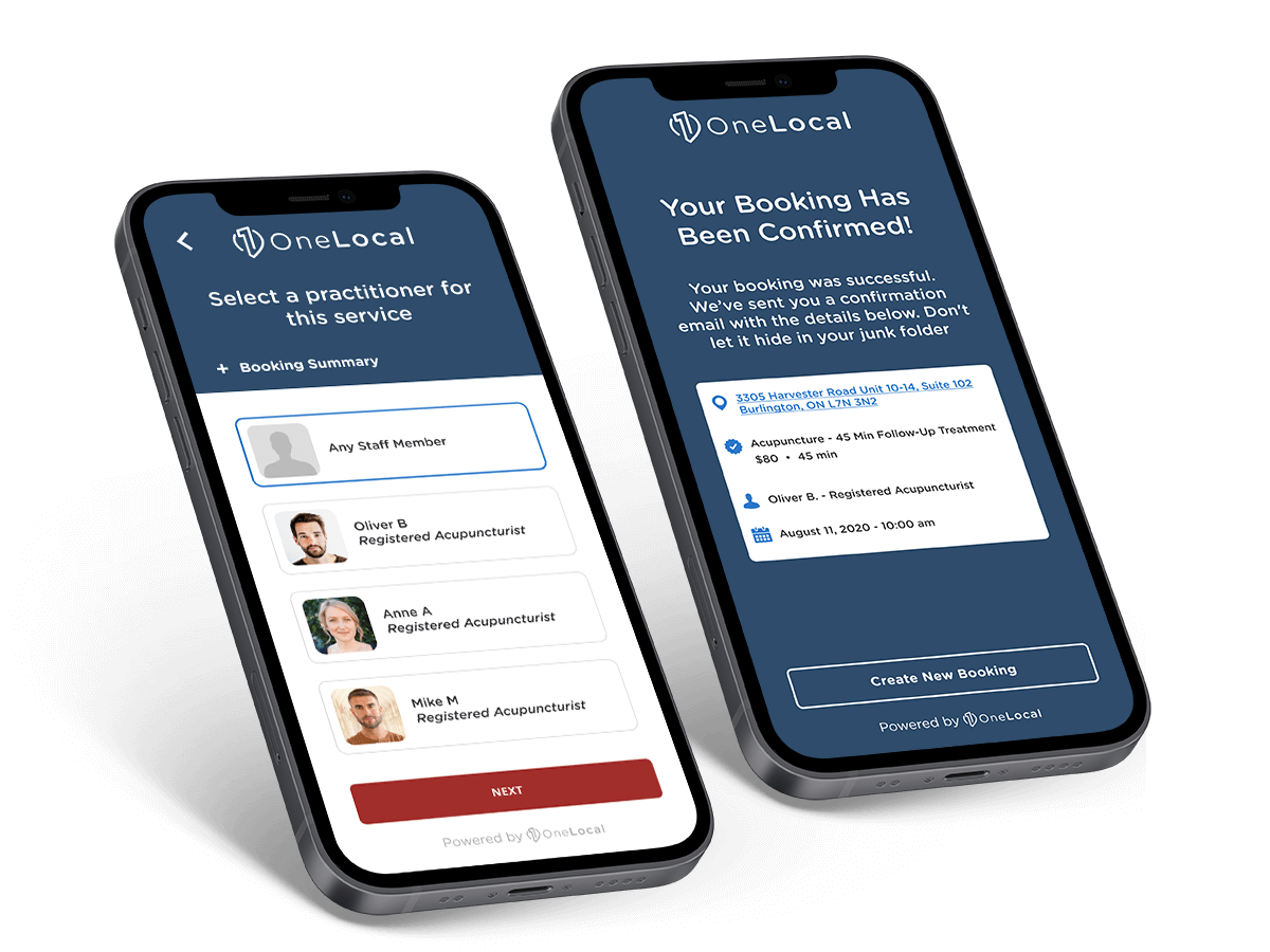
The mobile experience was designed for quick, on-the-go booking. Most customers were already used to doing everything from their phone, so the flow focuses on a small number of clear steps: choose what you need, see when it's available, and confirm. Each screen keeps the layout focused and familiar, so booking an appointment feels fast and lightweight instead of like filling out a long form.
Section 05
On desktop, the same journey is adapted to a larger canvas, giving customers a bit more room to review details before confirming. The steps stay consistent with mobile: select a service, pick a time, add your information, and finish. The layout makes it easier to scan, compare options, and feel confident about the booking from start to finish.
Section 06
Every booking triggered a matching transactional email, designed with the same clarity and lightness as the product itself. Four core templates cover the full lifecycle of a booking.
Section 07
Because this product was white labeled, it needed to adapt to any partner's brand tone and colors. We set default styles that felt clean and modern, and during onboarding, our account managers selected colors with partners so the product felt like a natural extension of each business. No complicated theme system, just thoughtful styling that worked for everything from beauty salons to auto shops.
EXAMPLE PARTNER
Soft, calming palette with warm accent, tuned for healthcare clients where trust and clarity matter most.
EXAMPLE PARTNER
Clean, clinical blues with bright accents, reinforcing professionalism and modern care.
EXAMPLE PARTNER
Grounded earth tones with a confident accent, approachable for a specialty practice.
EXAMPLE PARTNER
Bold, expressive palette with a pop of accent, energetic for beauty and lifestyle brands.
Section 08
The rollout received positive feedback from beta partners and account managers.
This project reinforced the value of designing with real world habits in mind. Many of these businesses were just beginning to transition from manual workflows to digital tools, so clarity and simplicity mattered more than anything.
It also shaped how I approach flows today: plan the journey first, then layer thoughtful design on top. When you get the foundations right, the experience feels natural instead of forced.
Working across the business dashboard and consumer booking flow at the same time gave me a deeper appreciation for connected systems. Both the user in the chair and the business running behind the scenes.
The companion dashboard that powered this consumer experience, where partners manage bookings, availability, and staff.